In the labyrinth of the internet, few things are as befuddling to users as encountering a 404 error. You click on a link, eagerly anticipating the promised destination, only to be met with a stark “404 Not Found” message. But fear not, dear readers, for in this post, we’ll shed light on the enigmatic 404 error, unraveling its meaning, its causes, and how you can transform it from a frustration into a delightful discovery.
Demystifying the 404 Error
Let’s start with the basics. A 404 error is a standard response code indicating that the server cannot find the requested webpage. It’s like trying to follow a treasure map only to realize that X marks the spot where no treasure exists. Frustrating, indeed!
Understanding the Why Behind the Error
But why do 404 errors happen in the first place? There are several reasons. Perhaps the webpage no longer exists, the URL was mistyped, or the link is broken. It’s the digital equivalent of hitting a dead end in a maze – disorienting and disheartening.
Making Lemonade out of 404 Lemons

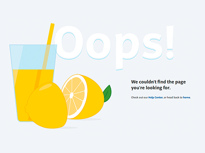
While we can’t go Cave Johnson style and tell life to take its 404 Lemons back, we can still turn those lemons into digital lemonade. Encountering a 404 error may initially leave users feeling lost and perplexed, savvy website owners have turned this digital hiccup into an opportunity for creativity and engagement. Enter the custom 404 error page – a chance to inject personality and charm into an otherwise mundane occurrence.
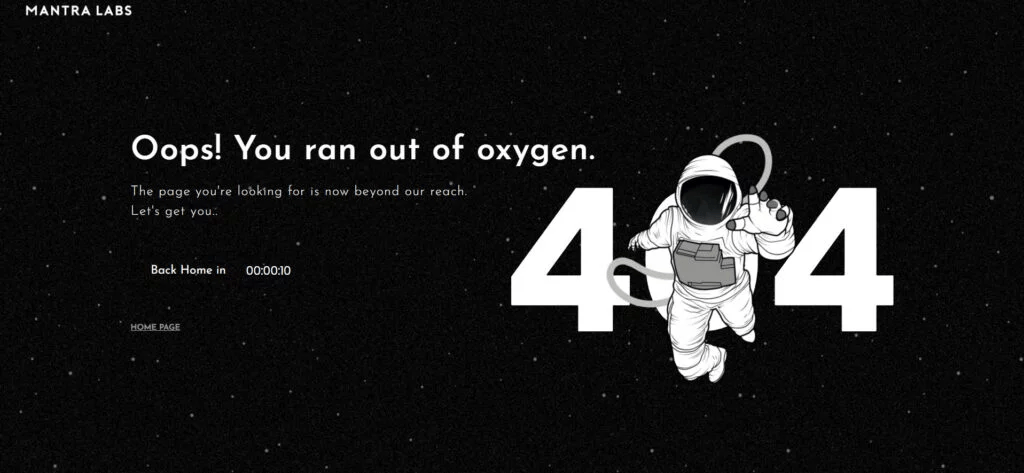
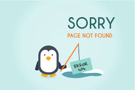
Creating a custom 404 page for your website presents an opportunity to inject personality and humor while guiding lost visitors back on track. Start by infusing the page with your site’s tone and feelings; whether it’s quirky, professional, or playful, let it shine through. Incorporate elements like your brand colors, fonts, and imagery to maintain consistency. Embrace humor to lighten the mood, perhaps with a witty message or a funny image that acknowledges the visitor’s detour. Consider adding helpful links to popular pages or a search bar to assist them in finding what they were looking for. Remember, while a 404 error may initially frustrate users, a creatively crafted page can turn it into a memorable and engaging experience that reflects your site’s intention of providing both valuable content and a touch of entertainment.
If this just seems like a bunch of words, an example might help:
Imagine visiting a website and stumbling upon a 404 error page that greets you with a whimsical illustration of a lost explorer holding a map upside down. The message reads, “Oops! Looks like you’ve taken a wrong turn. Fear not, fellow adventurer! While this path may lead to nowhere, there are plenty of other treasures to discover. Why not explore our homepage and chart a new course?”
Conclusion: Turning Errors into Opportunities
While encountering a 404 error may momentarily disrupt the user experience, it doesn’t have to be a dead end. By understanding the nature of 404 errors, addressing their causes, and creatively designing custom error pages, website owners can turn errors into opportunities for engagement and delight. So, embrace the 404 error as a chance to showcase your brand’s personality and guide users on a journey of exploration and discovery. After all, even in the vast expanse of the internet, every wrong turn can lead to something unexpectedly wonderful.

If this has peaked your interest and you want to check out more creative 404 pages, Traqq has their favorites posted on a blog here!

2 Responses
You have the most creative vocabulary and I know that has to play into your SEO ranking. Great work!
Indubitably! I’m particularly ardent about expanding my vernacular 🙂