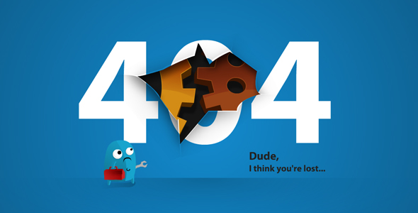
One element that the customer will see every time they visit your website that could be dramatically improved is the 404 error page. Plug in a URL, even a real or broken one, and you will experience one of these errors so we know you cannot escape them. A 404 error may seem like a minor issue, but if customized in the right way, a 404 error can turn a bad experience into a good one, and a good one into a great one both for your customer and for your website.
A 404 page is the message we receive from a web browser when we try to go to a URL and the server can’t be found. Instead of the thing we are looking for, we get a boring computer message. The opportunity here is to remain in conversation with people who have reached a dead end and offer them branded directional counters, navigation route maps, and maybe a warm reassurance so that they don’t exit in frustration.
Your 404 page is another opportunity to leverage your logo, color palette, typography, and tone of voice both to confirm brand awareness and leave another positive impression. A nicely designed 404 will feel more personal – it’s an opportunity to infuse a little character and wit into your website, with a funny quip, a quirky graphic, or an interactive element beyond a boring page.
A well-designed 404 will also help to minimize bounce rates presenting your visitors with a path to stay on your site for a little longer. For the best 404 pages, you should have embedded a few relevant links pointing to popular pages, recent posts or even a site search function. You can boost your SEO with customized 404 pages, too. By linking to relevant content and creating a frictionless browsing experience, you can facilitate the crawling of the site and enhance the indexing of your pages – both of which indirectly affect your site’s overall SEO.
No Responses