I’m sure we’ve all run into this issue at one point or another. Of course, it’s when I’m crunched for time or looking for something very specific. So seeing those numbers can also come with seeing a little bit of red.
While I may be frustrated either way, websites can customize their 404 Error pages to make the experience more enjoyable and retain users.
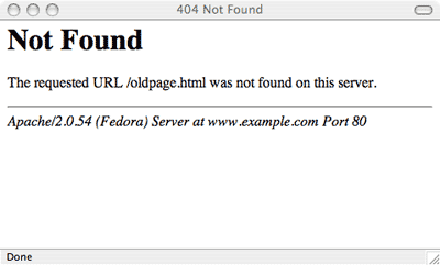
Check out this 404 error page:

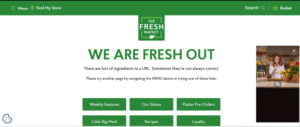
Basic right? Not much to it and it doesn’t help me as the user. I’m inclined to go back to the SERP and find something else. Now check out this one:

I don’t know about you, but I have different reactions to each one.
While both examples come from the same type of client error, the ladder adds more substance for the user. It has a cute phrase at the beginning and encourages me to click on another source to solve my problem.
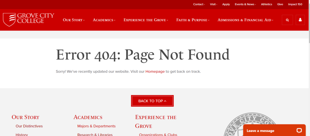
Now here’s an example of the most common 404 Error page that I’ve found:

This is fine, but it has nothing that would encourage me to stay engaged. The most it has is a “visit our homepage”… not very creative in my opinion.
So while 404 error pages aren’t fun, they’ll happen on your site no matter how diligent you are with mapping out your content for the user. Your best bet is to create a custom 404 error page. Try to show a little brand personality or throw in some humor to mitigate the stress for your end user.
No Responses