In the realm of the hilarious errors of the internet, there are business that take advantage of the mistakes and take a chance to connect with their users. Here are a few that I found interesting and I hope you do to!
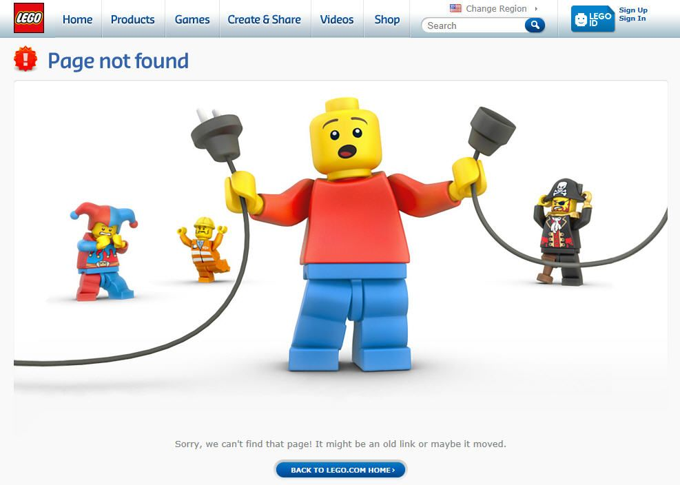
1. Lego: This little lego guy shows up when you are looking for a page that does not exist. A lot of people in the world know the famous lego man, and especially since you are on the lego page it is quite characteristic that he shows up;

2. Google: I don’t know about you but there have been many times where I am stuck playing this dinosaur game that Google has when there is no internet. Thankfully it has provided many with entertainment to many while they are waiting for the internet to come back.

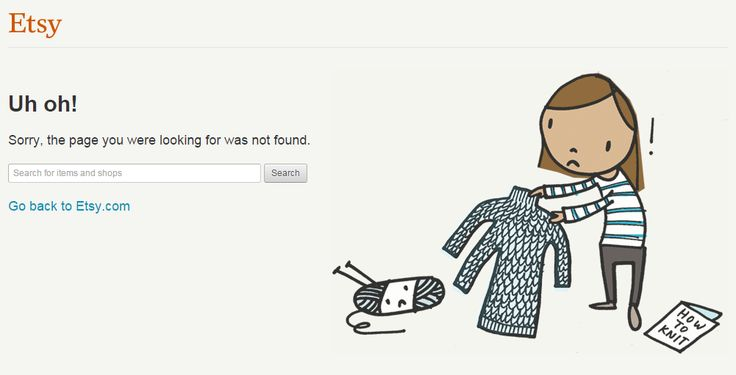
3. Etsy: Etsy’s error page is a creative yet caring 404 error page that it provides its users with. It is showing a silly little sweater that accidentally has a third arm, but also shows that they care by providing a search bar to try your search again.

By providing your users with a sort of custom 404 page, it could bring them joy or provide them with a memory with your website that could make them more willing to come back in the future or to retry their search. This could also increase your flow of traffic if people talk about your 404 page enough!
4 Responses
Hi there , thank you for your insight into this topic. I think that being creative in this area can be funny and cool for the audiecne to look at to see the human behavior behind the screen like you were saying.
This is a great way to talk about 404 errors, it is cool to see how the different companies use their creativity for that specific page, and really speaks to how much they care for their internet presence.
Love the post! This is a great way to present the creative potential of the 404 error, and the imagery you used helps demonstrate that wonderfully. The content is both accurate and effectively separated by your numbering. The only thing I might change is to add a creative 404 error picture as your features image, so your fun and funky aesthetic is more apparent to scrolling viewers.
404 pages are a great way for businesses to show that they know their way around website making, as well as give good guidance as to where the user can go from there!