404 errors don’t have to be boring! I love when websites choose to do fun things with their 404 errors pages. It shows attention to detail. Customers don’t feel so miffed whenever the page they are looking for doesn’t exist.
I wanted to take the chance to go over a few of my favorite 404 error pages, courtesy of https://www.404s.design/.
The Duck
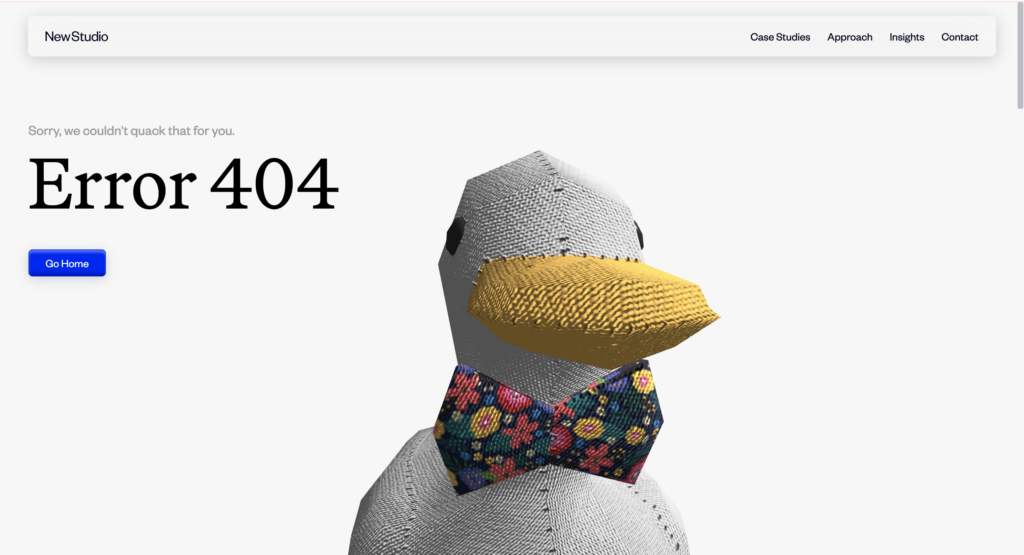
This 404 error page by NewStudio is hilarious, technologically advanced, and punny. Those are all things that Professor Sweet mentioned he wants to see in ours. I specifically loved that the face of the duck follows wherever your cursor is on the page. The company specializes in digital, design, and strategy. They call themselves a transformational agency. It makes sense that even their error page would have an element of fun design to it.
I don’t know why they chose a duck though. They don’t have a duck logo, or anything like that on their site or social media.
Maybe the software developer loves ducks. Who doesn’t? Especially if they wear a bowtie.
French Lifestyle
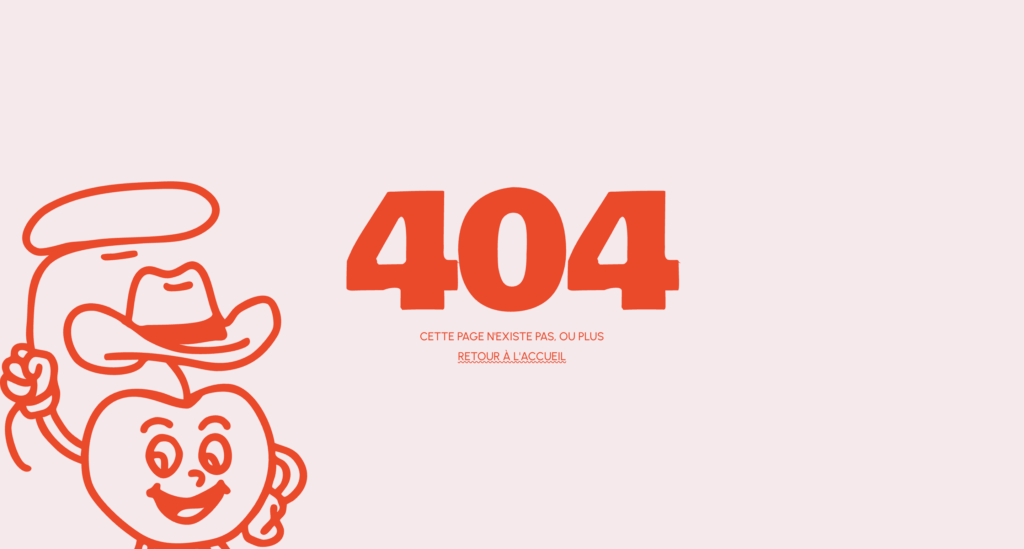
As we all know, I LOVE the combination of red and pink for websites (made evident by my portfolio). This 404 error page is simple, but fun. The whole website is full of personality and motion. The little cowboy mascot is perfect, as I don’t see him having a moment anywhere else on the website. I also love that the 404 is the same font as their headings on the rest of the website.
Even though I don’t speak French, I quite enjoyed this page.
See the full website here.
Interactive 404
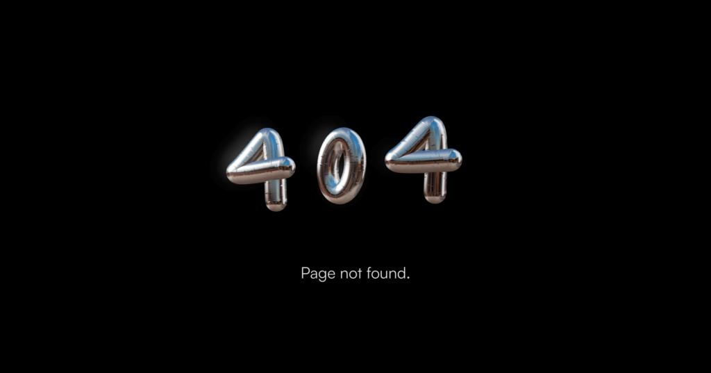
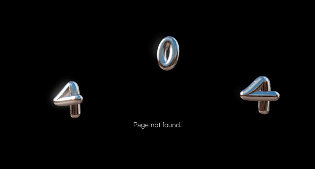
This 404 error page is super simple, but it does the job. I absolutely love these 3D numbers. The owner of the website is a creative and 3D designer, so this detail truly does his talent justice. His name is Eric Holton.
Someone looking to hire him may encounter this error and potentially be annoyed, but the detail of being able to move the numbers around is such a fun idea. He didn’t waste a single ounce of space on his portfolio website, utilizing every chance to get his skills across.
See his full portfolio here.
Art Gallery
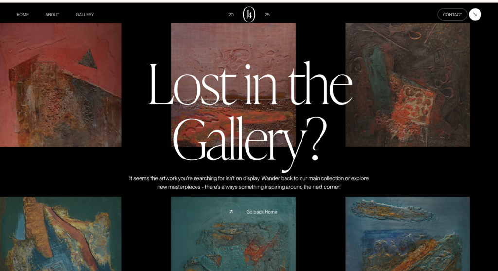
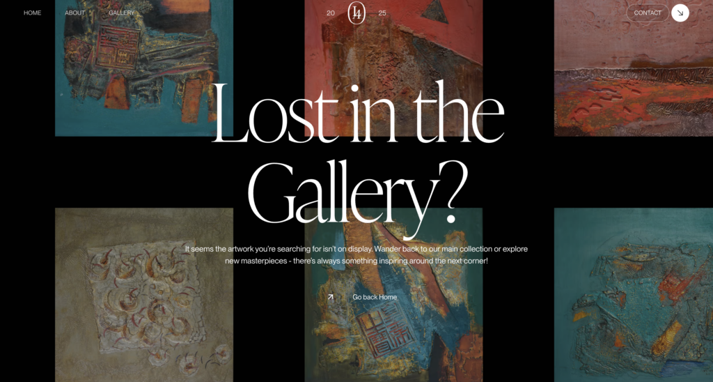
You can scroll around the gallery in this 404 error page. This is a lovely opportunity to present artwork even if a link is mistyped/broken. This feels very true to the rest of the website, and keeps the viewer’s attention. I stayed and scrolled around for a while. I had to go see the actual gallery for myself, as I wanted to see the names and stories around the nameless gallery I went through on the 404 page.
Conclusion
I can’t wait to create my own custom 404 page. Sometimes the most fun parts of creating a website, like making a silly 404 page, might never be seen by the user. But for those who do see it, it really just adds to the experience. Let’s create a new era of fun 404 error pages.
5 Responses
This is a great post! I love the images you included. It definitely helps show your point.
Really cool post Mara. Great attention to detail and some really fun 404 pages.
These are such fun and unique ideas! I love the thought of this, it is definitely an easy thing to do to improve your website. People typically would not think to do this.
This was so fun to read! I loved all of the unique ideas. I love the included images.
I liked how you showed that 404 pages can still be part of the user experience instead of just an error. The examples made it clear how personality, interactivity, and design details can keep users engaged even when something goes wrong.